The problem
The existing site fights its own brand — white outlined lettering and an electric-blue location pin sitting on busy, bright blue. Every piece of information a customer needed was on the page, and almost none of it was findable.
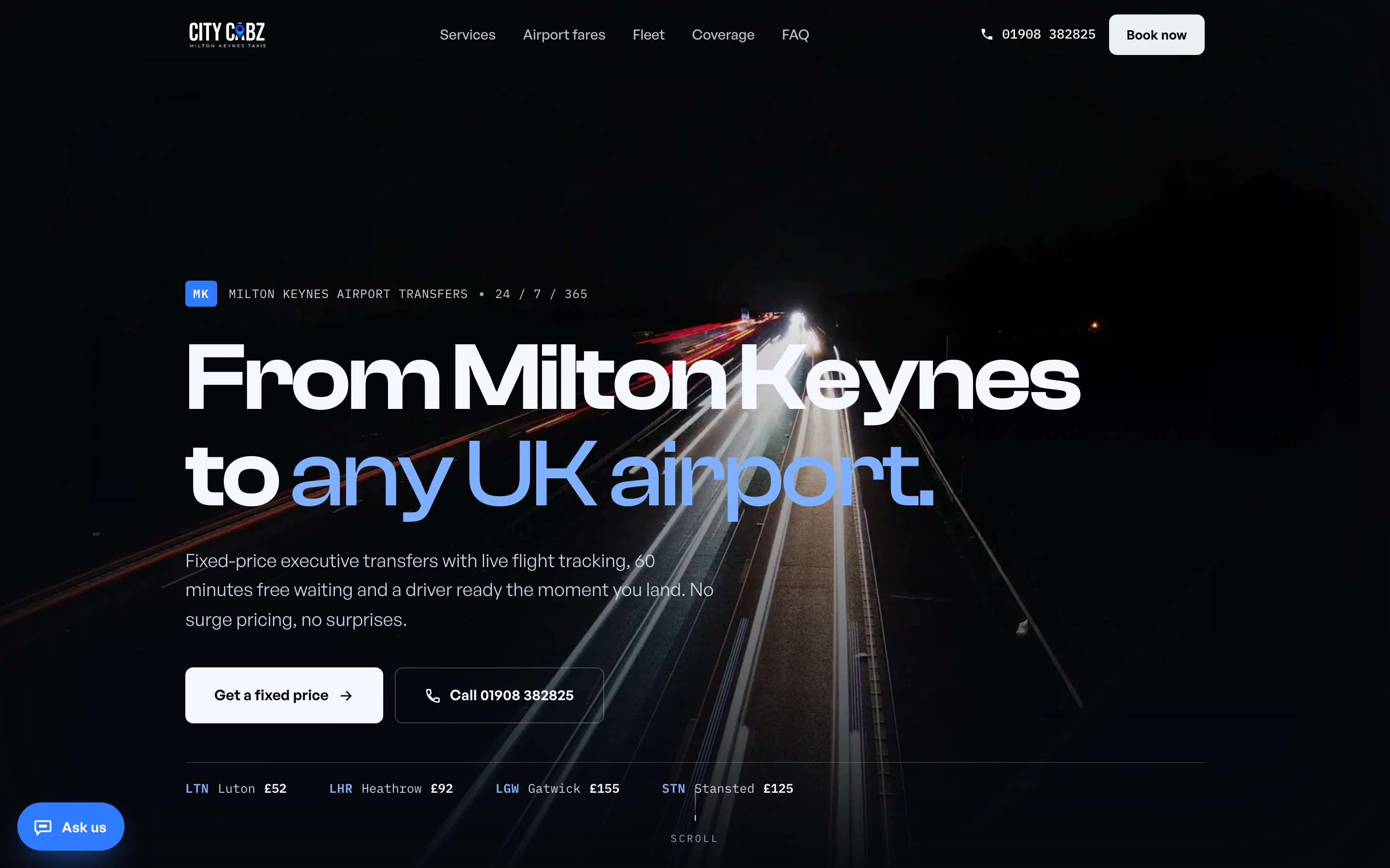
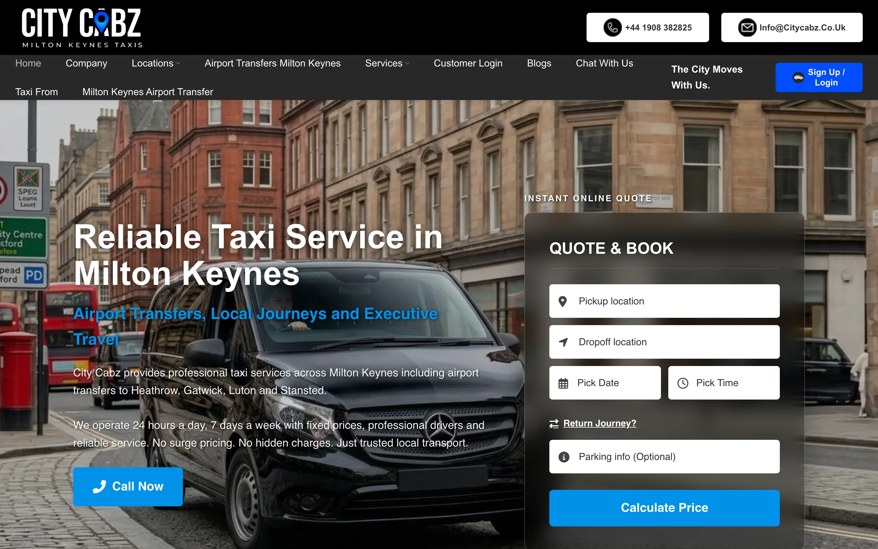
Drag to compare. Left is the site as it stands; right is the rebuild.
Executive Midnight
The palette is pulled straight out of their own logo: midnight behind it, the pin's electric blue and cyan in front. Clash Display and General Sans — no Inter, no Roboto.

A hero that looks like the job
Real rainy-London-night footage — black cabs and wet reflections — web-optimised with a poster image behind it so nothing is blank while it loads.
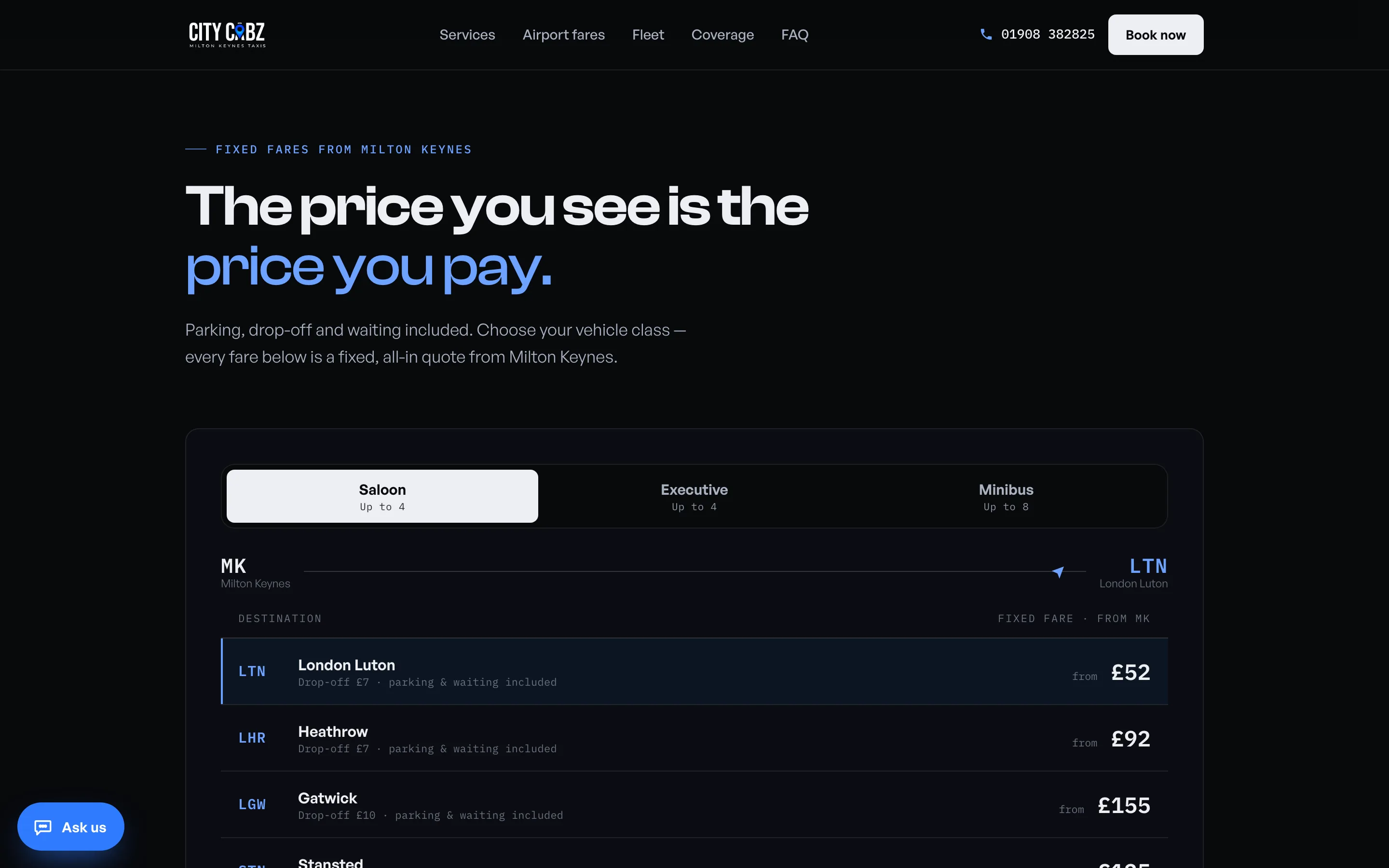
The fare matrix
Saloon, Executive and Minibus tabs with counting-up prices and a route line that animates between Milton Keynes and the chosen airport. All seven airports across three classes, taken from their own fixed-price tables.
What was hard
Going dark without losing legibility
A dark rebuild of a bright site is where contrast quietly breaks. The palette came out of the logo rather than a mood board, and every text and background pairing was checked at 375 pixels wide.
A seven-megabyte hero that still arrives
The video is compressed for the web and sits behind a poster frame, so the page is never blank while it loads. Playback was verified rather than assumed.
Counting up real numbers
Every animated price is driven by component state, never by writing into the DOM directly — the pattern that keeps animated numbers from tearing a React page apart on navigation.
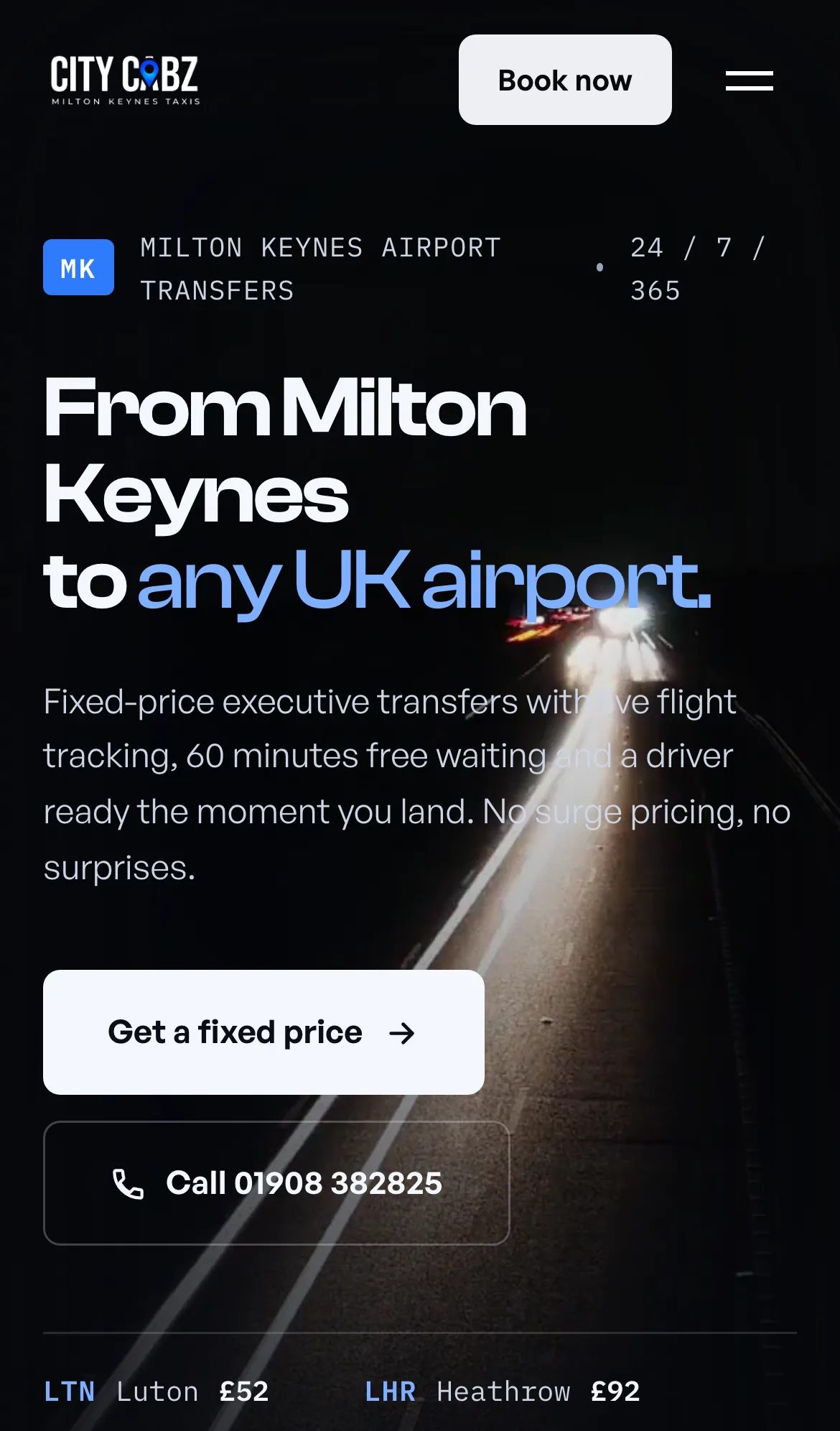
On a phone
Most of City Cabz’s customers arrive on a phone, so that is the width the design was decided at.