The problem
The old site was quiet and generic. Nothing about it said kilo sale, and nothing about it said Hackney. The shop is loud, second-hand and cheap on purpose — the website was none of those things.
Poster, not brochure
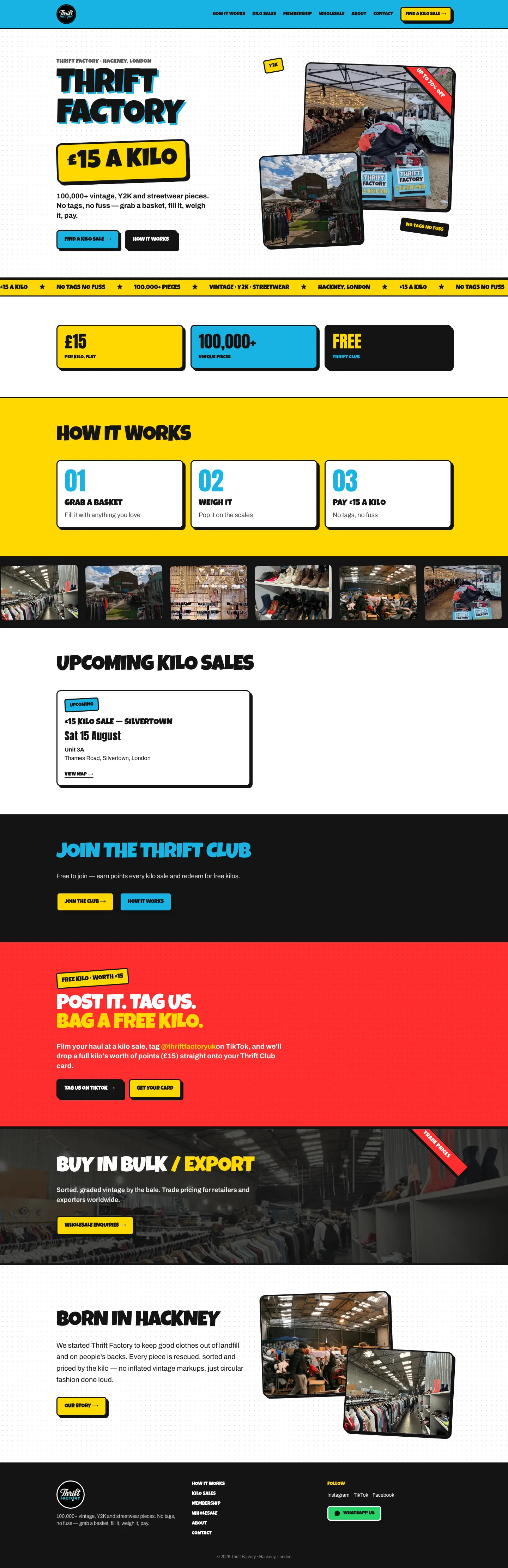
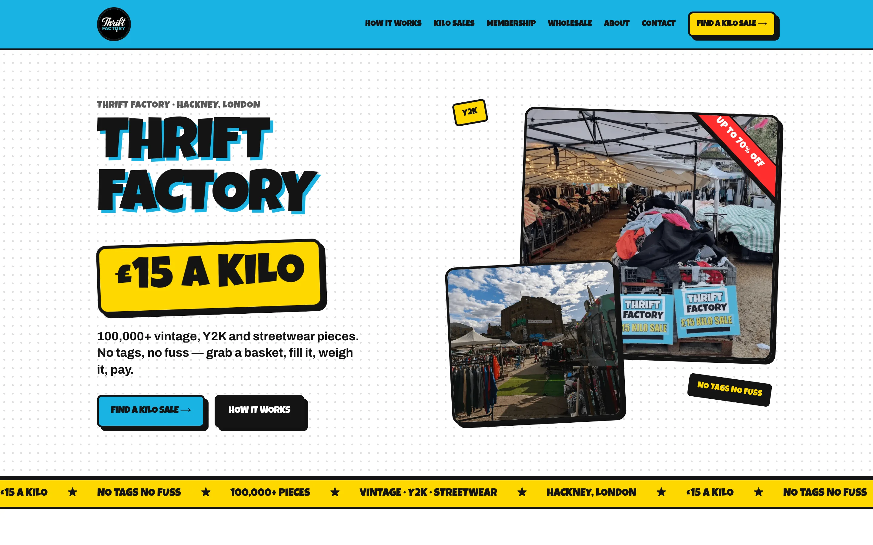
Luckiest Guy display type, the brand's cyan and yellow used as accents over ink and paper, red diagonal sale ribbons, and real photography throughout.
The price that flips
The headline price animates between £15 and £12 so the current kilo deal is the first thing that moves on the page.
Seven pages and an enquiry route
Home, how it works, kilo sale events, membership, wholesale, about and contact, plus a branded 404 — with a validated enquiry form behind it.
What was hard
Loud without becoming unreadable
It took three passes. Premium and curated was too soft. Solid cyan blocks read corporate. What landed keeps the brand's cyan and yellow as accents grounded in ink and paper, so the page shouts without turning into a wall of blue.
Motion that knows when to stop
Flipping prices, tickers and marquees all respect a reduced-motion preference, so the design's energy is not forced on someone who has asked their device for less of it.
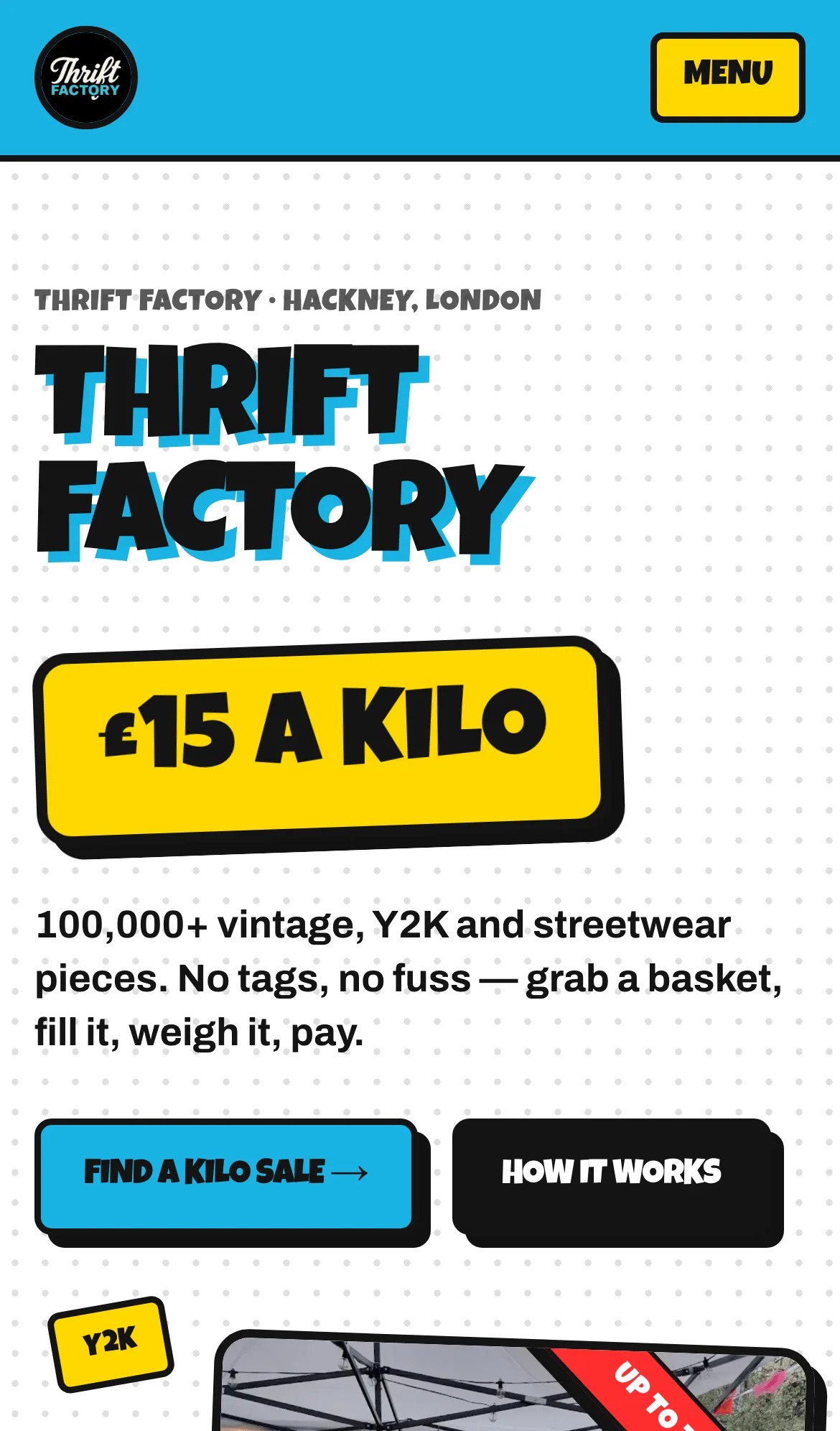
On a phone
Most of Thrift Factory’s customers arrive on a phone, so that is the width the design was decided at.